“Can you help me with my new restaurant?”
It was that question most professionals dread, a family member in desperate need with a short timeline. Lucky for my niece, I was in between jobs and had some spare time on my hands.

She was weeks away from opening a restaurant in New York and the Graphic Designer she had hired gave her a logo and disappeared. She still needed to complete her brand identity, website, and signage before opening.
She sent me the logo and it had some issues. The foremost being that the brand name was in Thai and I thought that would make it difficult to communicate the brand in this country, so I started over.
She sent me the logo and it had some issues. The foremost being that the brand name was in Thai and I thought that would make it difficult to communicate the brand in this country, so I started over.
As she sent me pictures of the restaurant, I noticed a grill that is the centerpiece of the cooking style called Moo Ka Ta. It’s a big brass grill and hot pot that sits at the center of every table.
It was beautiful and I just knew that it would make a great logo. It’s right there in front of you every time you sit down at the table, not to mention it has a cool pattern built into the design.
She needed the whole package, a logo, business cards, staff uniform, signage, and a website. As I got deeper into the project, I realized that the All-You-Can-Eat style needed some explaining so I developed an illustrated step-by-step guide that defined the brand style.


It’s a freehand illustrated family casual vibe and it’s been well accepted.

As opening time got nearer, I realized I could be more helpful and get things done faster if I was there in New York, so my niece in trade for all the help she was getting flew me out.
It was great fun. The energy was high and we scrambled around photographing food for the website and social media posts, scouring local shops for decor, and staying up late putting it all together.
With the little time we had, we managed to pull together extra teapots and grills along with some gold paper and the nick-nacks we found at the thrift store and shape them into a playful backdrop for the front counter.
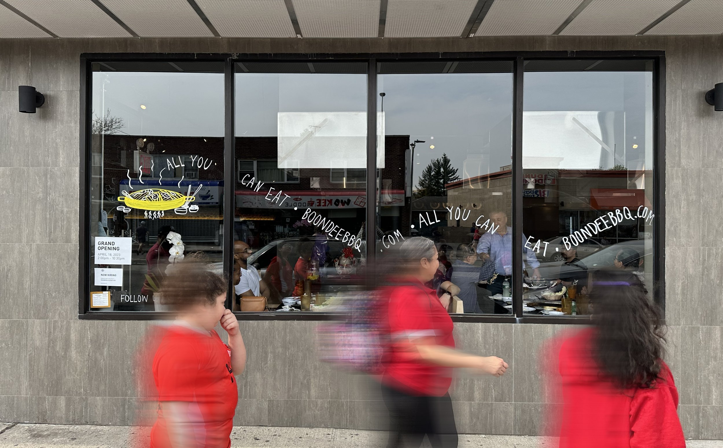
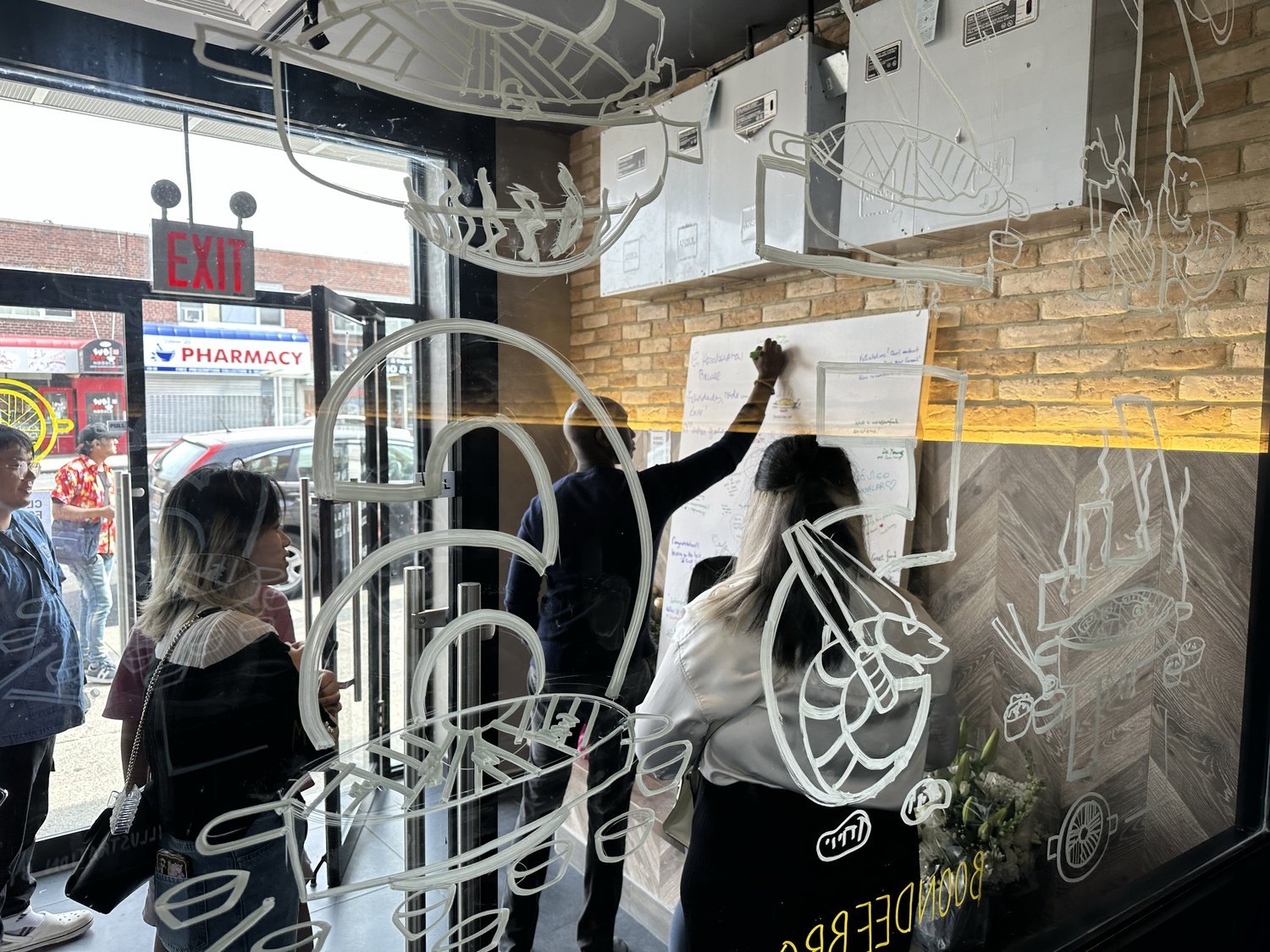
In a last-minute burst of inspiration, I saw a woman painting on her storefront windows and thought that would be a fun way to introduce people passing by to the Moo Ka Ta style of dining.
So off I went to the local art store for supplies and to try my hand at freestyle drawing on glass. I just remember it being late in the day and my hands shaking from a lack of food but it turned out well and people loved it.
It worked so well, she decided to make it permanent, so I recreated the design to be cut in vinyl and she had a local vendor do the installation.


